8 Ways to Maximize Space in your Home
There are many reasons to embrace the idea of thoughtful use of space in your home. Downtown dwellers in wee condominiums and apartments, adopters of the tiny home shift, and anyone looking to maximize space in their new or existing home can benefit from consciously adjusting their space to allow for an airy feel, even when there’s not a lot of square footage to go around. A few tweaks to areas can make them feel like custom homes.
Fortunately, there are things you can do to make your space feel larger and even luxurious. Many of them involve tapping onto your ability to work with light, scale, and movement to make your eye perceive more space without necessarily adding any.
8 Ways to Create and Maximize Space in Your Home
- 1. Start with white
- 2. Play with reflections
- 3. Lighten the visual load
- 4. Size matters – go smaller to feel bigger
- 5. Extend the gaze
- 6. Plan your layout
- 7. Simplify décor
- 8. Bring in experts
How to Make a Room Feel Bigger
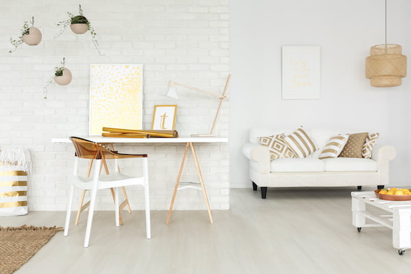
Start with white
Adorning your walls and ceiling in a shade of white opens up the room and allows your eye to see to the depths of every corner. It helps your eye to blend the borders of walls and ceilings so that your gaze travels upwards, and walls seem taller. White creates calm and tranquillity with a cloud-like effect, and it allows the architecture of your space to be highlighted instead of focusing on the wall colour itself. White is the colour of snow, but it doesn’t have to feel cold. Add touches of wood, leather and neutrals to help bring a warm touch of luxury to this now open space.
This article from Real Simple serves as a helpful guide for selecting the right white for your room.
Play with reflections
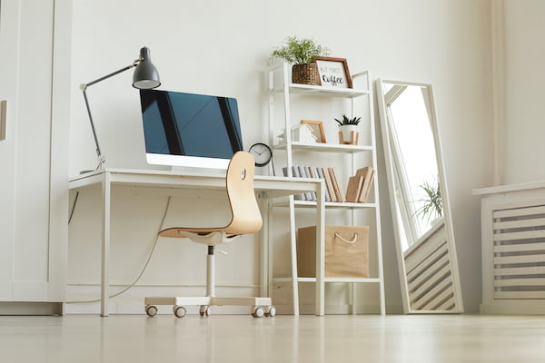
Mirrors are a great accessory to any layout to give the appearance of more space. Mirrors reflect the room in their frame, and as a bonus, mirrors also bounce the light around, making a brighter space and offering a more open feel.
Lighten the visual load
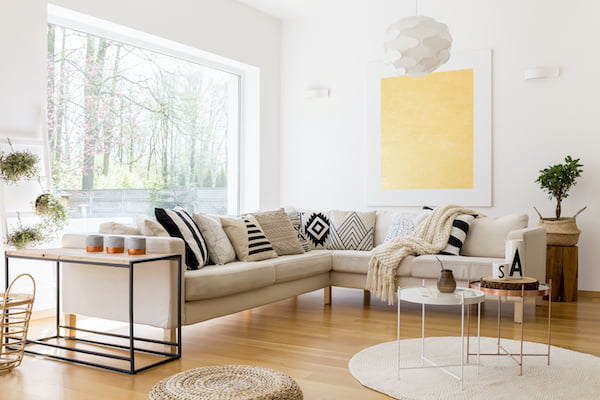
If your space has windows, there’s an excellent opportunity to open up your walls by minimizing or eliminating draperies. Thick, dark, or heavy fabrics take up space in your room and interrupt the eye as it takes in the view. Consider swapping out clunky drapes with light, thin cloth blinds or shutters. Having curtain bars that extend far beyond the window frame will also help keep the view through your window accessible by letting the curtains stay out of the way of the window. Area rugs can interrupt the eyes in the same way. Consider doing away with the rug altogether, or using a thin and simple mat, shying away from bold designs that pull in the eye.
Size matters – go smaller to feel bigger
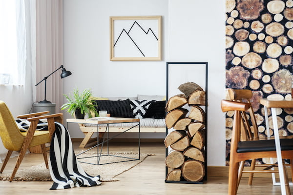
Simply put, the larger the objects are in your space, the less room you will have. Sleek, well-designed furniture can offer as much seating space and comfort as an overstuffed couch or boxy chair while taking up a much smaller amount of your room. Keep in mind the height of the piece as well. Lower-profile furniture allows your eye to see more of the walls, leading to a larger-looking space. You can lower the height of your pieces by opting for a shorter leg, or in the bedroom, no legs at all on a loft-style bed, and low-backed chairs and headboards will offer the same result. While we’re on the subject of legs, if you’re able to opt for a svelte, lithesome leg on your furniture, you can add more visual space near your floor in ways a chunkier style cannot. Furniture with a front draping covering the legs and area beneath the seating would also be useful to avoid, for the same reason.
Extend the gaze
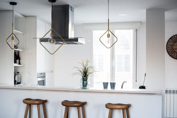
The more your eye can flow from object to object without having to stop and skip here and there, the more space it will seem that you have. Take advantage of this visual quirk by embracing long or tall items where you can. This sounds contradictory to the previous note to make furniture shorter to see more of the wall, but there are times when tall and slim is better than shorter and broader. For example, a bookshelf that stretches up high while keeping a narrow width will give you more floor space and allow the eye to skim across the shelf in one long sweep. A light fixture with longer hanging bulbs can provide the illusion of length more than a shorter, wider one. Even adding vertical lines to the walls themselves can give the room added height and, therefore, the idea of more space, in the same way vertical lines on clothing can be more lengthening than a horizontal stripe. Vertical shiplap can add this look. Length can be added to your horizontal world as well; a shallow and wide credenza will add more space in a room and allow the eye to flow more than a deeper but narrower dresser could.
Plan your layout
It’s tempting to push all of your furniture to the outer edges of your space to allow for more movement in the centre of the room. However, this space can often become cluttered with end tables, coffee tables, and everyday objects needing to be navigated when traversing the room. If you’re able, grouping your furniture on one side of a room to give an accessible walkway can open the space up and reduce any claustrophobic feelings you might have while picking your way through a disordered maze.
Simplify décor
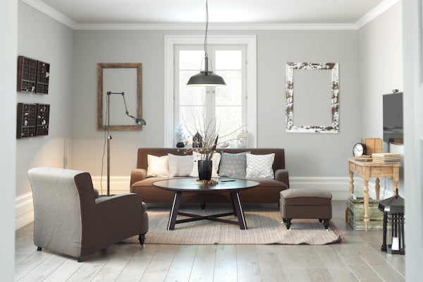
This one can be an ongoing battle as we live our day-to-day lives and acquire new and interesting things. Of course, the more you own, the more chaotic your décor and living space becomes. Regularly reflect on the items you own and pare down where you can. One larger statement piece can be more space-saving than many smaller knickknacks. If your favourite pieces are smaller, try grouping them, so the eye sees them as a group instead of noticing each one individually, interrupting the room’s flow. Group your wall art in the same way – feature walls are a great way to show off an eclectic collection of art while maintaining the flow of your space. While it would be no fun to say you should live in a colourless world, it can be beneficial to stick to a colour theme or palette. The more contrasting colours you employ, the more an eye must work to take it all in. Keeping your decor simple and intentional is a sure way to lend to a larger-looking space.
Find more tips on decorating and organizing your small space in this great gallery from Country Living.
Bring in experts
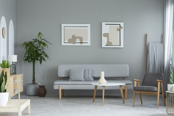
Sometimes a room is simply not designed to maximize space, and there are obvious, or maybe not-so-obvious tweaks that can be made to your layout to allow for a more enjoyable and useable floorplan. Before you call a realtor, it can be an excellent investment to hire a professional to come in and move a wall or closet, shift a staircase or rearrange a kitchen or bathroom layout. A home remodel can gain you large amounts of square footage, for less than the cost of moving to a larger home, and you end up with a custom home that you love.

We were inspired to write this after seeing the great ideas in this post from Remodelista. If you like this article, be sure to check out more expert recommendations from Gemstone.